Work that
Speaks for Itself
From brand launches to marketing campaigns, explore how I’ve helped businesses stand out.
The Reginald & Dionne Smith Foundation
( the RDSF )
Logo & Brand Identity Refresh
Client Overview
The Reginald & Dionne Smith Foundation (RDSF) is a nonprofit dedicated to improving total wellness for families impacted by HIV, viral hepatitis, and substance use disorders. Through education, advocacy, and community connection, RDSF helps families access resources and care with compassion and cultural relevance.
Target Audience
A key focus of RDSF’s mission is HIV awareness and testing—particularly reaching heterosexual Black men, who remain underserved and often overlooked in mainstream HIV prevention campaigns. The brand identity needed to reflect trust, approachability, and cultural authenticity in order to engage this audience while still feeling inclusive to the broader community.
Project Goal
The rebrand aimed to:
Modernize RDSF’s visual identity.
Build trust and credibility with heterosexual Black men while maintaining broad inclusivity.
Communicate warmth, strength, and professionalism across platforms.
Create a consistent system for digital, print, and community-facing materials.
Original Branding
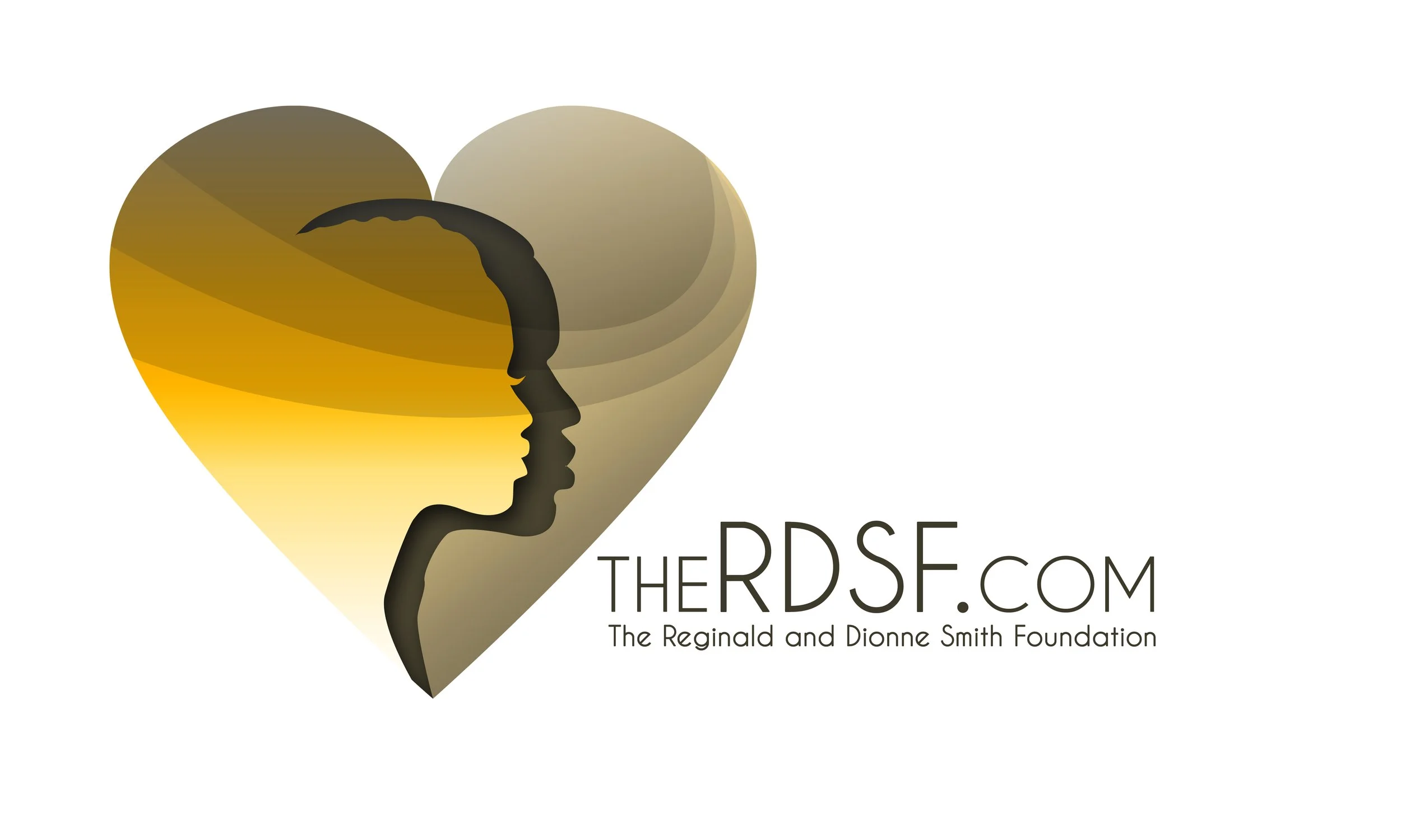
The original logo featured layered silhouettes within a heart symbol. While it symbolized compassion, it leaned toward a more generic, health-service look. The gradients and soft typography did not strongly connect to the desired male audience, and scalability issues limited its effectiveness across digital campaigns and outreach materials.
Limitations for the Audience
Felt abstract and less approachable.
Did not strongly resonate with Black men, who are central to RDSF’s outreach.
Color palette and gradients suggested a dated, less professional identity.
The Redesign Solution
The new brand identity is more direct, confident, and relatable to the foundation’s core audience while remaining community-driven and inclusive.
Logo: Simplified silhouette mark with bold typography communicates strength and clarity. The figures emphasize people at the center of care, but the sharper, modern lines feel stronger and more relevant to a male audience.
Color Palette: Deep purples for advocacy and dignity, paired with gold for hope and resilience, and anchored by navy for stability. This palette balances warmth with professionalism and connects culturally with the Black community.
Typography: Clean, contemporary sans-serif type increases readability and presents RDSF as modern and credible.
Application: Campaign graphics and layouts center Black families and men, reinforcing relatability and trust.
Final Deliverables
Redesigned logo (primary + secondary variations).
Expanded color palette with cultural resonance.
Typography and style guide.
Brand board and application assets for digital campaigns and outreach.
Website Redesign - TheRDSF.ORG
Audience Impact
The refreshed brand identity gives RDSF a stronger voice in HIV awareness campaigns for Black men. By removing visual complexity and introducing bold, culturally resonant design, the foundation is now better positioned to:
Build trust with heterosexual Black men and encourage HIV testing.
Present a professional, contemporary image to partners and funders.
Maintain inclusivity while centering those most impacted.




University of the
District of Columbia
–
David A. Clarke
School of Law

Client:
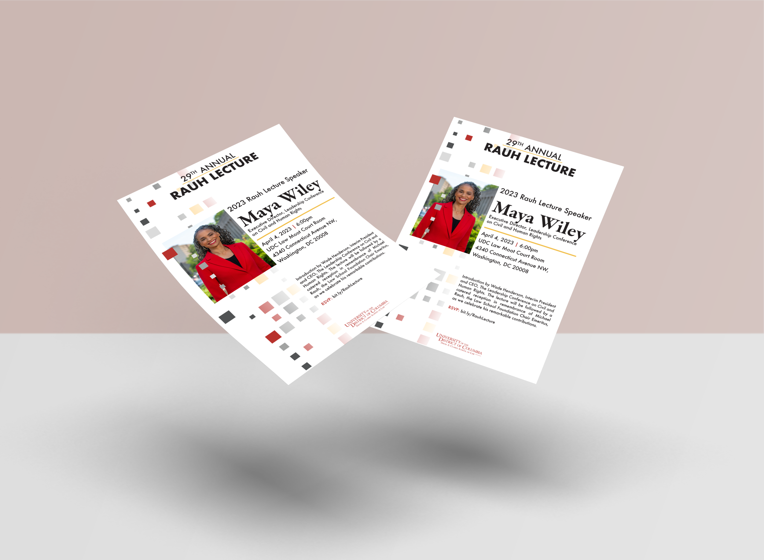
University of the District of Columbia (UDC) – David A. Clarke School of Law
Scope of Work:
A series of print and digital design projects to support the School of Law’s events, programs, and communications.
Approach:
The goal was to create a cohesive design system across multiple formats that reflected the law school’s professionalism, community impact, and academic prestige. Each piece needed to align with the university’s existing brand standards while elevating the visual appeal for prospective students, faculty, and event attendees.
Outcome:
The designs provided UDC Law with polished, on-brand materials that enhanced their events and recruitment efforts. The viewbook, in particular, became a key asset in presenting the program to prospective students, helping communicate the school’s values, strengths, and culture in a visually compelling way.
Key Skills Highlighted:
Multi-format design (print + digital + large format)
Brand-aligned visual storytelling
Layout and typography for professional institutions
Cohesive campaign execution across deliverables




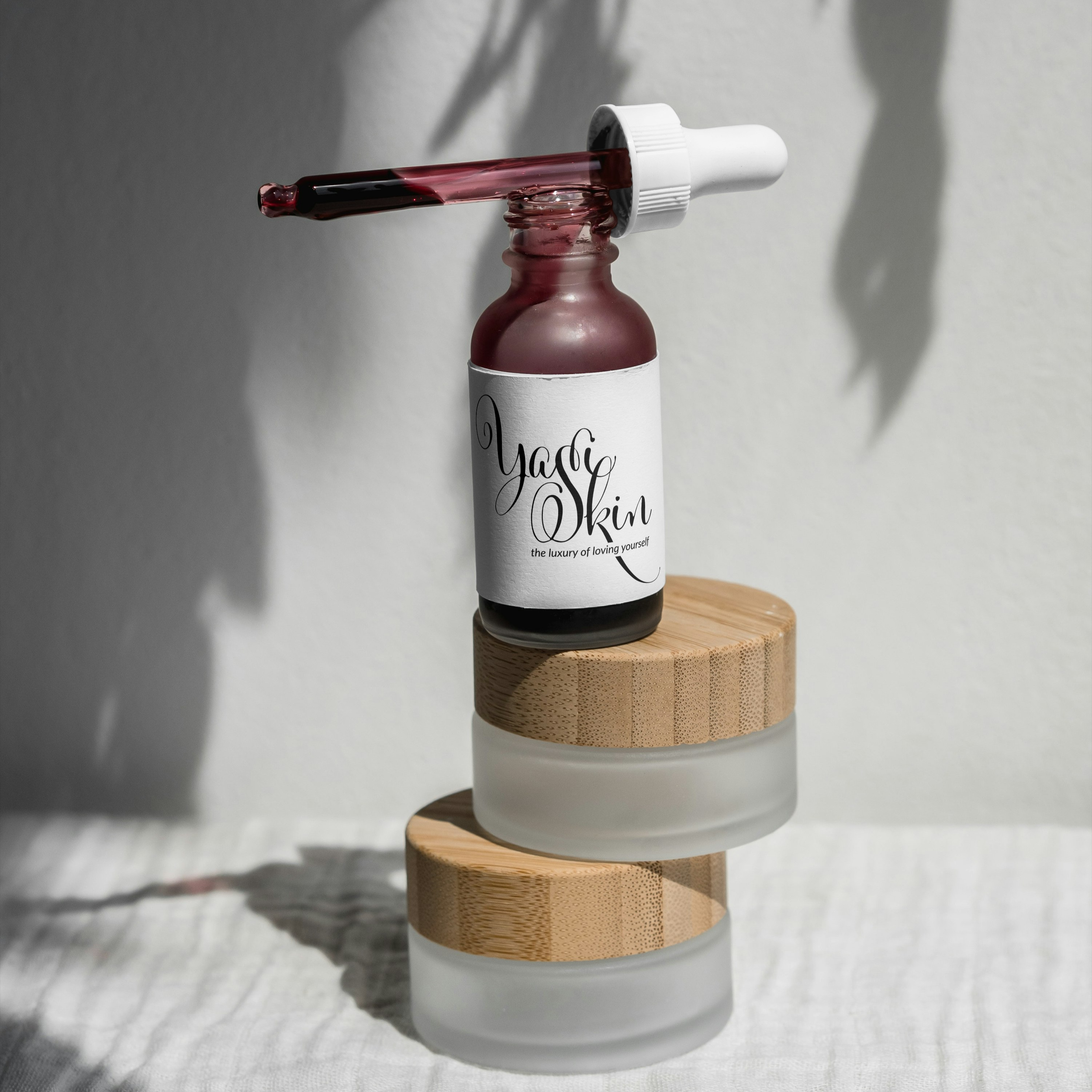
Yasi Skincare
Client:
Yasi Skincare – Concept Branding Project
Scope of Work:
Developing a logo design concept and visual identity for an emerging skincare brand, with mockups across key product packaging.
Approach:
The design direction focused on clean, minimal aesthetics that reflect the purity and effectiveness of the brand’s skincare products. The logo was crafted to be versatile, adaptable across both digital presence and product packaging, while conveying a sense of elegance and trust. Mockups were created to bring the concept to life, showing how the identity translates across a full product line.
Outcome:
The final concept positioned Yasi Skincare as a modern, aspirational brand ready for the wellness and beauty market. The cohesive visuals gave the client a strong foundation to build upon as they refine their product line and overall brand identity.
Key Skills Highlighted:
Logo design & brand concepting
Packaging design & mockup presentation
Minimalist, luxury-inspired visual style
Consistency across product line applications
